30-second summary:
- Heatmaps represent user engagement data on your web page in a graphical form.
- They were introduced by Cormac Kinney, the software maker, to help traders beat the market.
- Today, marketers use heatmaps to visualize users’ behavior on content and improve their content marketing accordingly.
If you are on the digital marketing scene, you’ve probably already heard of heatmaps. They are a great tool for marketers to see how users interact with websites.
For those of you who are newbie marketers, let’s have a brief look at what a heatmap is.
Heatmaps: Introduction and types
A heatmap can be explained as a tool for data visualization. It represents different values using colors, to show users complex data sets.
Heatmap shows:
- How well a particular page is performing?
- Which of your content grabs users’ attention first?
- And if there is any content they aren’t understanding or interested in.
Heatmaps use colors ranging through the spectrum from blue to red, with blue being the coolest (showing low engagement with the webpage) up to red, the warmest (showing high engagement levels).
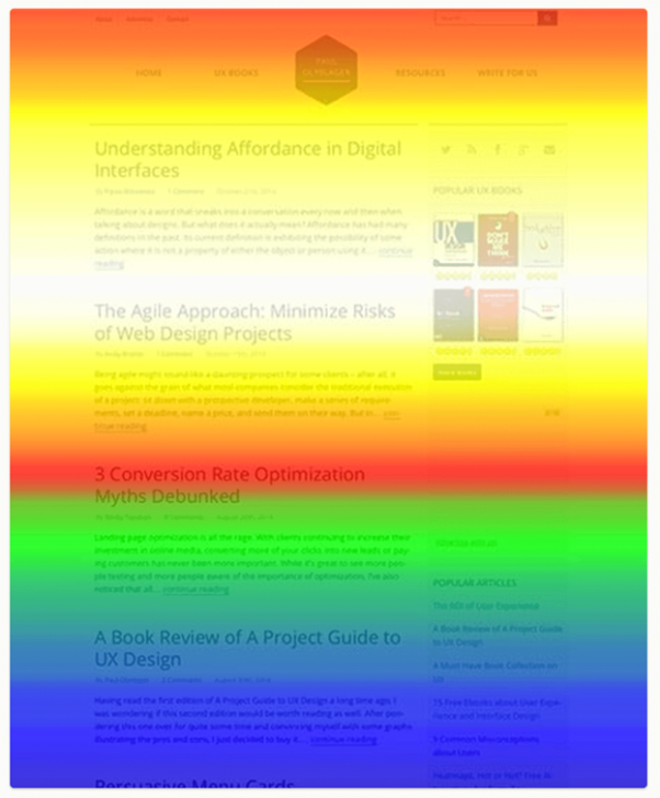
Take a look at the following example. The bright orange and red show the highest engagement from visitors, and the other areas are not viewed so often.

sources: Crazy Egg website
You can see visitors have mainly focused on the top of the page and much fewer have scrolled all the way down.
There are different kinds of heatmaps to choose from, depending on what kind of information you want to get.
Here are three of the most popular heatmap types:
- Overlay reports: These break down clicks on your website into percentages, so you can see where people are clicking the most and where they are not.
- Scroll maps: This option will show you how far down the page users get before they stop scrolling and reading.
- Confetti report: This is a high-resolution view of a traditional heatmap. The difference is a confetti map lets you see individual clicks. Each click is shown by a colored dot.
So now you know what a heatmap is, and the different types to choose from, let’s find out some ways to supercharge your content strategy using heatmaps.
1. Find the missing pieces of the content puzzle
Once you have added content to your page, you will want to know not only how many people see that content, but how much is read. Do they read two lines then leave, or does your content hold their interest?
A scroll map will show how far down the page your visitors go, so you can tell how much of your content they are reading.
For example, let’s say that Tom writes a fascinating, in-depth webpage about growth hacking.
He explains about documents, cases, and what customers tend to do, and also reveals the reasons a lot of solutions are not useful.
Tom publishes his findings online and shares it. The traffic looks good. People are visiting and reading his page.
Tom is happy with this, but still wonders whether they are really reading it, or whether they are looking at it and leaving. He decides to check his visitor reports.

sources: Crazy Egg website
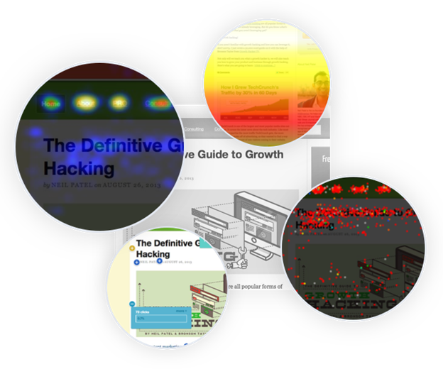
As Tom (and you) can see, by looking at the scroll map, only about 1 in 15 or even 20 readers get to the end of his page. That means most are either not reading it or only reading a part of it.
As well as this information, the scroll map offers more insights into website user behavior.
It shows which content people spent time on, which filters and menu options are most used, which sections are scrolled over without being read, and how far into the page they click away.
The data can be used to create more effective website content in the future.
Paid search data allows you to uncover keyword opportunities for creating relevant content, social media posts and ad copy, but add heatmaps into the equation and you have even more knowledge about what content your audience wants.
Combine the use of heatmaps with Google Analytics to see how long users stay on your site before they bounce. You will be able to see how far most of them get to before they leave, and figure out the reason why.
Is there something missing from that page? Is it difficult to read? Is the content irrelevant?
The heatmap will show you exactly which parts they are interested in and where they drop off, and you can use this knowledge to improve the content.
2. Smooth out the friction between users and CTA
Heatmaps are often used to help understand how website visitors are interacting with CTA buttons and other on-page elements.
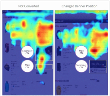
Take a look at this image. You can see on the left, the users spent more time looking at the advertising banner than actually at the website checkout buying something.

sources: Convince & Convert website
You can see on the right that some small changes have been made, in order to encourage users toward the marketer’s preferred action.
3. Optimize images to grab attention
Another use of heatmaps is to show you the best places to add images. More visitors than you probably realize try to click on unlinked images.
For example, let’s say a blog post has a high bounce rate. Visitors are coming but they aren’t staying and you want to know why.
This is where a heatmap comes in very handy.
A confetti click track report might reveal that your visitors come, try clicking on several things which are not clickable, then get annoyed and bounce.
So they do want to click through. They just don’t know how.
Let’s take a look at another example. This one is two versions of an ecommerce landing page.

Source: VWO website
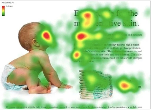
In the first image, the baby is looking right at the viewer, making him the most attention-grabbing thing on the page.
But look at the second image. Here the baby is looking at the text. This helps subconsciously guide users’ attention to the web copy and the message it offers.

Source: VWO website
4. Uncover the “why” behind cart abandonment
Another great use of heatmaps is to test UX and usability.
For example, an online retailer discovers a lot of people are shopping at their online store and adding items to their shopping cart but then abandoning the cart rather than purchasing the items.
Some UX testing can show the retailer why this might be.
Overlays and heatmaps show where people click and where they don’t.
Maybe the checkout button isn’t easy to spot, or it’s too low on the page.
It could be that the shoppers are getting distracted by a colorful nav bar or there are annoying ads or popups driving them away.
Perhaps they are trying to click the non-clickable elements and getting frustrated.
Once these distractions or problems are removed, do an A/B test on the page in question to find out more on which one converts.
5. Boost your conversion funnel
Testing how effective your content marketing is, as well as testing UX and usability, will help make it easier to move potential buyers down the conversion funnel.
For example, if a few visitors are reading a whole piece of content and all of them are signing up for your free guide, you are improving your sales team’s leads and your content is successful.
But what about, on the other hand, many visitors are coming to your landing page, but nobody is interested in getting your free guide or joining your email list?
Simply check the heatmap and find out where they are clicking, and if they are clicking at all.
Maybe they are trying to click but they are clicking the wrong element or it isn’t clear where to click. Or perhaps something is broken on the page.
Do you see a high number of drop-offs on a particular page?
Do people seem to hover for a long time on a strange part of the page?
Keep a record of the weak spots you find on the different pages, then improve them and see if you can get fewer bounces and better conversions.
The main thing is to check for issues that might stop your visitors from converting, whether that might be images that look like clickable buttons, poor web copy, or a confusing checkout experience.
6. Strengthen your internal links
The anchor text used to link to different pages on your website gives more context for what that page is about, or at least that is how the search engines view it.
Internal links let you establish a content hierarchy where the most important pages are seen as the most valuable, and allows you to distribute link equity between different pages.
If you rely on content to grow your site, then internal linking is a great strategy used to strengthen the authority you have about key topics. Content may be grouped into ‘pillar’ or ‘cornerstone’ pages and subtopics.
So what does that have to do with heatmaps?
As you know, heatmaps offer detailed information about where visitors click. This helps you measure internal link performance. The insights you get can be used to drive more traffic to pages by optimizing your link placement.
7. Enhance outbound links too
Although offering tempting outbound links might seem like driving users away from your website, it is not as counterintuitive as it sounds.
Including outbound links in your content is good SEO practice.
Linking to reputable sources shows both readers and Google that you want to provide useful information. According to Stanford University research, the links you choose to feature can tell readers and search engines a lot about the quality of your content.
For example, linking to a spammy site will harm your credibility.
So how do you use heatmaps to assist with good outbound links?
A click map can show you which of your outbound links are the most clicked on, as well as the least. This will give you an insight into what your audience is most interested in.
Which of your outbound looks do visitors want to click on? Which do they find most interesting or most credible?
A scroll map is also useful for improving outbound links. Perhaps readers are finding one of your links irrelevant or spammy, and many are dropping off at that point.
If that is happening, it might be time to find a better website to link to, or get rid of the link altogether.
Otherwise, it could just be that the content on the page is not up to par, and needs some rework.
Conclusion
Knowing how users interact with the structure of your site, as well as its content and other elements can really help you develop a content strategy to retain visitors who read more of your content and convert more.
Heatmaps can help you get ahead of the competition by allowing you to identify friction-causing issues and find new ways to attract visitors and increase conversions.
Heatmaps are useful in many ways for marketers, but they are best when combined with other research tools.
Learning how buyers perceive and experience your website is crucial information and can really help with the success of your website.
Lyuthar Jacob is working as an assistant editor at a digital marketing agency – Clickmatix.com.au. He is the type of geek who loves to explore subjects ranging from Marketing to Lifestyle and Money Saving. And share his evolution through his write-ups.

